Everyone knows that New York City is a constantly active hub. The 24-hour running subway is one of the factors that entitle it to this fame. It’s one of the oldest, busiest and most complicated subway systems in the world. To serve commuters well, information design comes in helping New Yorkers and tourists navigate in this metropolis easily. Undoubtedly, New York City’s subway map design plays a big role. There is a controversial story behind this map.


The subway transit map for New York City had been creating since its inception in 1904. In the beginning, it was created separately without consistency by three different companies that built the different parts of the subway. Until The 1964/1965 New York World’s Fair, the NYCTA (New York City Transportation Authority) started to think of designing a consistent and comprehensive new map. After a no-winner competition of map design, NYCTA hired Unimark International to do the job on the recommendation of the Museum Of Modern Art in May 1966. Massimo Vignelli, known for his versatility and deliberate design thinking, one of the founders of the design studio, was involved and his map gets ongoing attention and discussion in the design industry. Vignelli’s map was released in 1972 but was replaced in 1979. The new map was lead by John Tauranac, which was outsourced by Michael Hertz Associates, being used until now.


There are several reasons for the replacement.
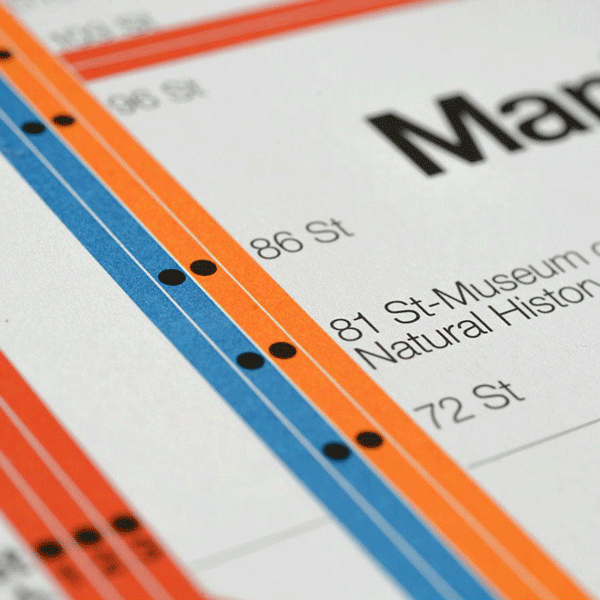
1. Some New Yorkers kept pushing the NYCTA to replace Vignelli’s map by a new one because they could not tolerate that Vignelli ignored geographical accuracy and designed a diagram instead of a map. In particular, New Yorkers’ proud Central Park was depicted as a grey square rather than three times elongated rectangle. Moreover, New York City’s streets were designed evenly and named by a numeric system. For delivering messages efficiently, Vignelli put dots evenly to represent train stops for commuters counting stops easily, but it just violated New Yorkers’ imprinted notion about their street’s pattern. Plus, the waters surrounding New York City was filled with beige. Overall, Vignelli designed a diagram instead of a geographic map. This “map” challenged New Yorkers’ conventional notions of how a map was supposed to be, which offended their views about the city that they love.


2. The external financial hardship in New York City resulted in misstep in the design implementation. The NYCTA did not have enough money to pay for the subway visual system design. Therefore, the department only took the Vignelli design team’s analysis and suggestion and generated the design without the team’s involvement, which created chaos. Even though later on, the department asked the Vignelli team to design a systematic scheme, NYCTA Graphics Standards Manual invented, they still isolated the team’s guidance and supervise. This cooperation deviated from the design team’s original intention and principles, so inevitably, there were some messages delivered to commuters incorrectly.
3. When designing the subway map, Vignelli was executing his “dot-to-dot” concept and the concept was not chased extremely. He did not want to show the aboveground messages to passengers which would just be overload information for them. Merely telling people where they should get on and off underground was Vignelli’s core concern. Perhaps, without labeling Central Park would decrease New Yorkers’ strangeness about this unconventional map, because the abstraction of Central Park gave Vignelli’s subway map a hard time.

It has been 42 years since the Vignelli map was replaced, but the debate around it never stops. And technically the Vignelli map is still better than the current one.
The most praised subway maps in the world are all diagrammatic. They are London Underground Tube Map, Moscow Metro Map, Berlin Subway Map and Washington D.C Subway Map. None of them faithfully comply with geographic accuracy, and they share the same concept with Vignelli’s Subway Map Design.
Here are the reasons why Vignelli’s map works better.
Control
Compared to the current New York City Subway Map, Vignelli’s Map makes people emotionally optimistic by giving them a stronger sense of control. In Vignelli’s Map, all the train lines only go horizontally, vertically or 45-degree diagonal, which is more regular, simpler and easier for commuters’ brains to process. This facilitates commuters’ familiarity with the map, so the sense of control increases and the calmness, confidence, and security come as well.
Scannability
Vignelli’s Map has stronger scannability. Scannability means that users can glean the information that they want and build a subconscious or unconscious familiarity in a brief moment. In the present New York City Subway Map, the train lines are like a plate of spaghetti randomly sprawling. It adds more difficulties to commuters’ minds to detect and find links and clues on the map. But looking at Vignelli’s map is a relief for our eyes and minds. Successful subway maps that share Vignelli’s concept also value scannability. For example, there is a big circle in the Moscow Metro Map. Just having a first glance, the major transfer hubs pop which are within the circle. Take Washington D.C Subway Map as another example. Washington D.C Subway Map highlights important transfer hubs by double circled and bigger dots. Also, the smart placement of Potomac River and Anacostia River tells users that central prosperous area is located in the South Western part in the city. As a new passenger experience such subway systems several times in the city, he will gain a general sense of the city’s structure. So Vignelli’s Subway Map is more helpful for a person to adapt to a complicated transportation system in New York City.


Peripheral Vision
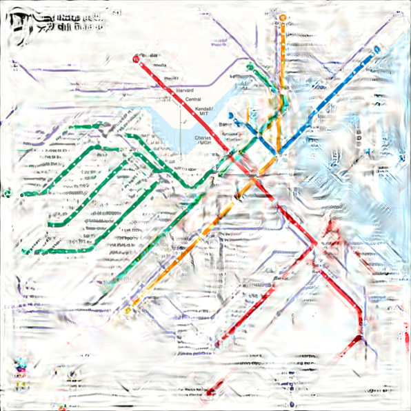
Scientifically, New York City Subway Map does not have to describe the city’s geography to be visually useful. An experiment about Peripheral Vision, conducted by MIT Vision Lab, can prove this. It was tested on the Boston Subway Map. Peripheral vision is a part of a vision that occurs outside the very center of gaze. The MIT Vision Lab experimented with Boston’s fifth and sixth subway map. The sixth looks more geometrically rigid, sharp and less curvy. The lab computed for a person who’s looking directly at the Kendall/ MIT stop on the red line to see the mongrel on the two versions. It turns out that the sixth maintains clearer looking than the fifth does. If this experiment is applied to the current New York City Subway Map and the Vignelli Map, there is no reason that the current map has a better result because it is way more complicated and undisciplined. Peripheral Vision can be an indicator for user experience designers when designing a map. It enables designers to create an information structure that helps users consciously and subconsciously process complex knowledge efficiently and get familiar with new knowledge faster.


The Application Of Vignelli’s Spirit
Though Vignelli’s Subway Map is not used officially, his concept of subway map design gets passed down in New York City. In 2011, the MTA introduced a digital and interactive map, a reinterpretation of Vignelli’s Subway Map, to show customers service changes on weekends. In 2014, NY/NJ Super Bowl’s Regional Transit Diagram was designed by Vignelli Associates, apparently bearing Vignelli’s spirit. The coming back of Vignelli’s ethos is the best proof that his subway map design is valuable for New York City.


Conclusion
In conclusion, there are great takeaways from the story of the New York City Subway Map. These are worthwhile to embrace different cases when designing things aiming to help people’s lives easier. First of all, balancing the familiarity and unfamiliarity for users while introducing a new territory to them. Once users are exposed to a new land, they just want to be familiar with the land as soon as possible. They want to feel like home. In the Vignelli Map, there is excessive unfamiliarity for New Yorkers. A map did not look like a map. The beloved Central Park became smaller. The convenient numeric street system was ignored. Those challenged New Yorkers’ imprinted daily movement and notions. It might be a decent approach if Vignelli even removed the symbol of Central Park to be more diagrammatic and abstract, which leads to a second point – identifying the focus information for users, what is the necessary and unnecessary for users. Recalling those great subway maps in the world, their designers inserted the city’s network and integrated structure. For instance, London Underground Tube Map and Washington D.C Subway Map point out the area where most of the transfer hubs are located by emphasizing stop dots. Berlin and Moscow Subway Map have an impressive shape to maximize the information gained by a user’s first glance. Compared to those great maps, New York City Subway Map reveal richer information, even lakes in parks, the complex contour of each borough. However, there is unnecessary information given a similar hierarchy with the essential, which prevents users from -building logic, patterns, and connections within the city. Last but not least, designers are responsible to walk clients through every design step from concept to completion. It is important to know not only for designers but also for clients. It is a back-and-forth process between clients and their designers. Clients should believe in designers’ professional capacity. In the story of the New York City Subway Map, designers’ guidance was absent, which lead to a deviation in the outcome.