The aviation industry is highly competitive. To have a strong connection with your target audience, logo design is an important part to consciously or subconsciously influence your audience. Here are some thoughts that we think might help you.

The Top 10 Airline Logo Design
During these unprecedented times many industries are suffering and facing challenges. Undoubtedly, the demand in the aviation industry falls dramatically. But think of the bright side – this is also a good chance to rethink your airline, like defining your niche loyal customers, who might become your potential customers after this crisis, or you might want to adjust your logo, etc. In terms of logo design, we pick the TOP 10 Airline brand Design that we like for your inspiration.
1. Pan Am
Catch the shape of the breeze
Pan Am was an iconic airline back in the 20th century. Though we don’t see its figure nowadays, there is still knowledge that we can extract from its logo. You might notice that many airlines are using a flight entity as their logos’ images. Though PAN AM logo looks traditional, there is a small detail in the wordmark that makes it unique. The tiny and thin bar extension depicts a feeling of a plane flying in the breeze, which gives viewers a sense of chill and stability when flying globally.

2. Qantas Airways
The abstract kangaroo depicts vitality
Qantas Airways is the biggest airline in Australia. They choose the national animal – kangaroo as their icon. Compared to the last version, the current logo is more abstract, modern and elegant. The kangaroo was remodeled by smoothing out the arms and adding gradient shadows, which speaks more than kangaroo and the animal’s vigor. The gradient between cardinal and tomato red also helps the brand look more high-end. The refining reflects Qantas’ modernized progress and premium service in the sky.


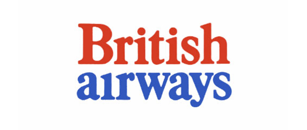
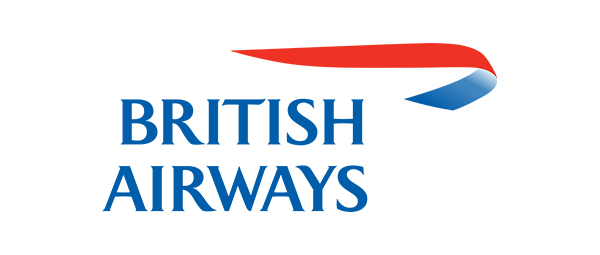
3. British Airways
The elegant ribbon carries on British noble ethos
British Airways logo has experienced three stages and each one tells a distinctive feeling. The previous two look either naive or sharp. The current ribbon logo is a good progress, because it feels softer and elegant. It reminds us of their “lady and gentlemen” manner in a modern way. The curvy and silky ribbon logo is like the silk inserted in men’s coat pocket or a piece of silk on a lady’s dress, even the sash that indicates royalty.


4. Thai Airways
A juicy Thai cultural concentration
When we see the Thai Airways logo, we all immediately ah ha! Yeah! It is Thailand! The shape of the logo and wordmark perfectly show the spirit of Thailand’s conventional and decorative aesthetics. The logo’s color palette interprets Thailand’s colorful culture in traditional clothes, handcraft, buildings. You name it. We are glad that they choose dark purple as the color covering the biggest area. And deliberately select the bright pink to brighten the whole looking. The color choices build up a solemn but vital brand image.

5. Emirates
The royalty is spoken by the beautiful Arabic calligraphy
The upper part of Emirates’ logo is stylized by Arabic calligraphy and has the same meaning as its wordmark written in English. The rectangular layout of the calligraphy is sending a sense of royalty, the same thing when you think of those luxury vehicle brands logos. For non-Arabic speakers, the stroke and composition in Emirates’ logo make us feel dignity. Also, the slightly wavy manipulation of the English wordmark, does it make you think of the softness of the Dubai gown?


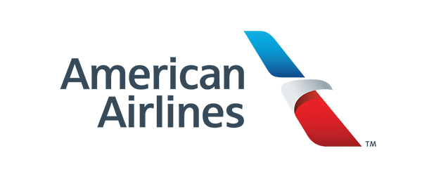
6. American Airlines
Be brave to overhaul to meet the target group’s need
The current American Airlines logo dramatically changed from the old one, which looks simpler, more modern and more suitable for its target audience’s expectation. As a brand design team, we believe that consumers are not just buying a brand’s products or services, they are actually paying for their benefit expectations from the brand. The old logo looks vintage and aggressive, but not appropriate for today’s travelers’ expectations – a professional, confident and friendly air carrier. The new logo looks milder and accessible, because the outline is smoothed out and rounded, and the application of gradient weakens the contrast of blue and red. American Airlines logo’s overhaul makes not only the brand accessible but also the national image.

7. Southwest Airlines
A colorful heart tells their genuine and warm business culture
Unlike the above airlines’ logos, Southwest Airlines doesn’t pursue a premium brand image. They want people to feel chill and warm, so they choose a more rounded typeface as their wordmark. Filling out a heart in the logo with the three primary colors (red, yellow, and blue) conveys their passion and sincereness. The logo hit a good color balance of not being too passionate or too cold. The same thing as the Thai Airways’ logo, Southwest Airlines uses a darker and colder blue among the three to cover the biggest areas throughout their visual system, showing their professional level and attitude, instead of allowing the brighter colors to yell and convey a cheap feeling.


8. Alaska Airways
An Alaskan face showing Alaskan personality and their famous aurora
Alaska is a snowy place and known for its aurora. So Alaska Airlines chooses aurora’s green and blue as its brand colors. And Alaska Airlines’ wordmark uses an adventurous and harsh typeface to represent Alaskan natural landscape. Meanwhile applying an Alaskan face tells Alaskan positivity and courage by a gently smiling face. The amazing part about this logo is the balance of the smile. It doesn’t smile too much, which would seem childish and funny, but also not smile so little that we can’t feel the friendship from Alaskan. And the strategy of using human face is rare in the aviation industry but makes Alaska Airlines impressive and memorable.


9. Hawaiian Airlines
An airline logo tells you reasons why you should travel to Hawaii
The same thing as Alaska Airlines, Hawaiian Airlines also uses a human face to show Hawaiian nature: hospitable and optimistic. Compared to the previous versions, we can see that the emphasis on delivering a message is shifting from a tangible object to a humanized connection. The current logo demonstrates the meaning of “Less is more” in logo design. Though the outline of Hibiscus (Hawaiian iconic flower) is flatted out, the valuable humanized spirit emerges and amplifies, which makes us feel more welcome. And the gradient purple stimulates our desire to check out Hawaii because it makes us associate it with sunrise and sunset which are the top desirable scenarios that tourists want during oceanic traveling.


10. Aegean Airlines
The shades of blue from Aegean give you calmness and peace
Aegean Airlines just gave a heads up of their new logo design but the new visual system is not applied in reality yet. But we have to pick it as one of the top airline logos design because it translates Aegean ethos very well – calmness and peace. The new logo reorganized and symbolized the two gulls in the old one to make them more graceful. We think the spotlight is that Aegean Airlines involves a new color – baby blue. The combination of baby blue and azure sums up our expectations about Greece: sea, sky, Santorini, and peace.


Other Angles Of Choosing Logo Design Elements
Expect the above logos, here are some logos that are not our favorite, but they offer some good perspectives about logo design in the aviation industry. Besides flying items, why don’t we look at other elements that reflect the regional culture, value or any other character?
- Traditional Pattern: for example, the Fiji Airways logo incorporates a Fijian pattern from their traditional indigenous Masi style.
- Historical Figure: for example, Aeromexico applies Eagle Knight in Mexican history to express business’ leadership, courage and fearlessness.
- Mythology Figure: for instance, Egyptair selects and symbolized Horus as their logo design (Horus is a winged god of the sun in Egyptian mythology).
There are various inspirations for airline logo design, from flying objects to abstract imagery and anything in between.
Finally some airline logo design thoughts from the Creativa crew
1. A symbolized and simplified logo based on a tangible object can evoke stronger emotion and tremendously transcends the object’s surface meaning, like the Qantas Airways logo, American Airlines logo.
2. As an airline business, if you want to tell your target audience about your premium and professional service as well as your vitality, it’s relatively safe to have a deep shade main color embellished or sprinkled by a color that has high saturation or value, like Thai Airways, Southwest Airlines and Singapore Airlines.
3. A gradient might be a nice transition to help your business transformation. There are two benefits:
- Avoiding overhaul but make the brand more friendly and high-end, like Qantas Airways and Hawaiian Airlines.
- Decrease the contrast of brand color to have a softer feeling, like American Airlines and British Airways.
4. Subtle manipulation of the wordmark is helpful to create an abstract concept or cultural spirit, like Emirates and PAN AM.
5. The logo and brand visual system is like the first layer of an onion. If you have an outstanding and impressive logo and brand visual system, you win the chance that your target group takes you home instead of other “onions”. Then you have the opportunity to offer more service and experience to cultivate their loyalty.
6. When designing an airline logo, it’s like arranging a trip for your audience. So we need to imagine the process like a field trip of taking your audience to your motherland and think of what you want to show them.